I recently learned the difference between typography, lettering and calligraphy. I tried to actively do some lettering (which involves drawing the words rather than just writing them artistically using continuous strokes), and then (for some reason) I decided to share my process. If done continuously, this whole thing could, at most, take just one to two hours. Probably.
First is finding an inspiration. Obviously you can be inspired by anything: book or movie or tv quotes, bits of poetry, your own life experiences. For this one, I was inspired by the movie Heneral Luna and by the film’s many themes. The film (which I’ve watched several times) was a cross of many issues and historical trivia, highlighting contemporary debates on personal versus public interests, sacrifice and the meaning of nationhood. This quote stayed with me after last night (there are thousand other funny and resounding quotes, but I was feeling particularly creative after that showing).
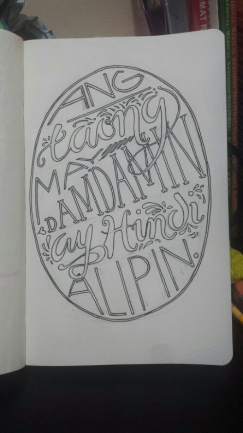
Ang taong may damdamin ay hindi alipin. (A person with feelings is no slave.)
Basically I’m, like, questionably a slave. I don’t know.
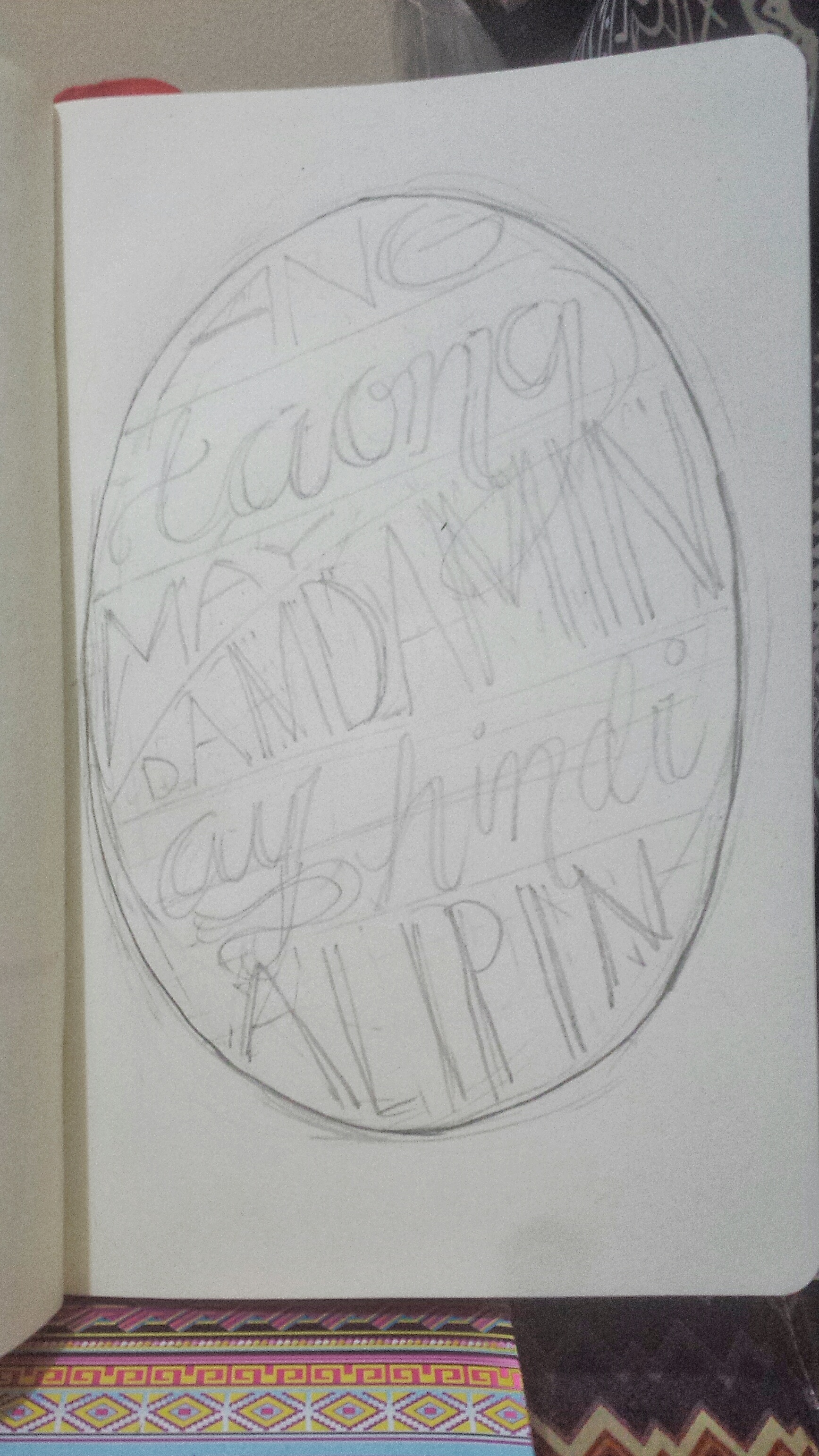
Anyway, I then plotted out a very general plan. It didn’t involve any choice in font or preference in kerning. I just wanted to layout the text and get a feel for what shape or structure I wanted the piece to take.

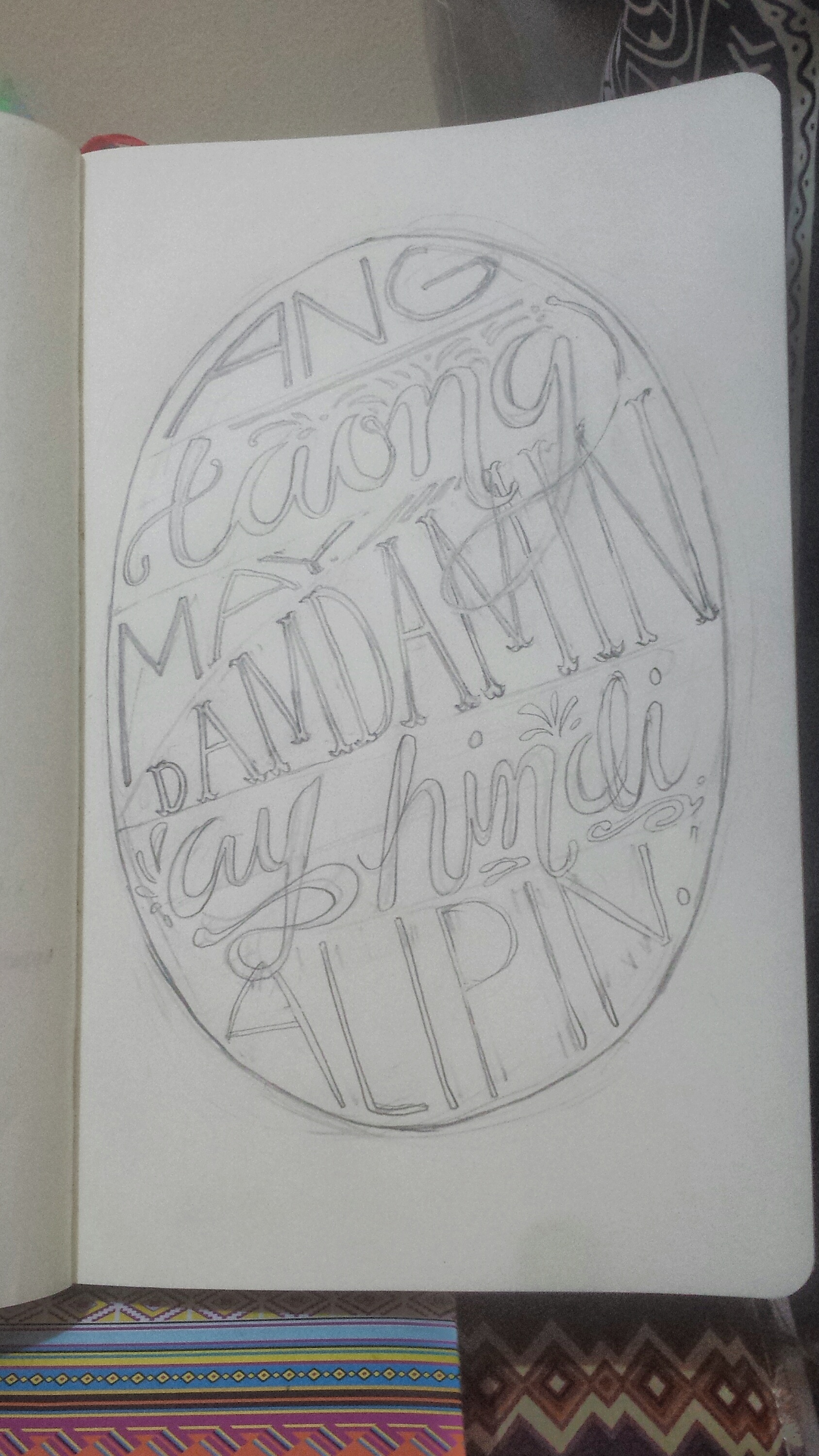
Next, I sketched out a basic skeleton. This time, I drew the piece at the size I ultimately wanted it to be. I also added in considerations of script versus other types, flourishes and kerning, body height and so on.
As I was finalizing the sketch, I added some decorations/ornaments and slightly changed some font styles to adjust the work’s focus (like in the word ‘damdamin’).
When you’re happy with the design, you can start inking. I used a run-of-the-mill gel pen to trace the outline. I also sometimes use finetip markers. Also, you can see that I changed parts of the design as I was finalizing the sketch.

When you’re happy with the inked version, clean up the design and consider coloring or shading.

You can leave it as is, fill the piece in with black, or color it. The first two options are optimal for digital media works. You can scan the design, clean it up with Photoshop and convert it to vector using Illustrator. Adding color and effects like drop shadow or stroke is easy using editing software.
Or you can color and add life to the piece using ink at hand, which I did. I used my relatively new Kuretake calligraphy brush pens. Their partly translucent quality makes them perfect for light coloring work.
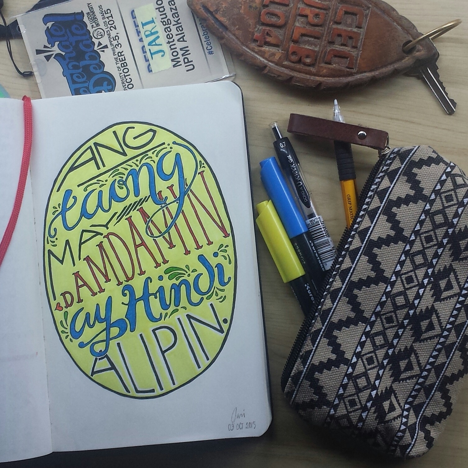
And there’s the finished product. It’s far from perfect, but that’s what practice is for!
Thanks!
Follow me on Instagram! (x)
xxx
Life Update I’m posting this from inside the UPLB campus (I’m here for the 7th Luzon Intervarsity). I actually worked on this piece in between debate rounds.
Just a small realization before I go to sleep: I like international tournaments better than local ones. It’s not an entirely new sentiment, but an incident earlier reminded me how much I love joining international tourneys in comparison.
In international tourneys, people are somehow more polite, more understanding and even more rational. There’s less of the clout effect and grandstanding so evident in local competitions. I also personally feel like the reason why I entered debate –to broaden my horizons and to hone my thinking processes constructively– is captured better when the atmosphere is friendlier and calmer.
Like, I don’t really particularly care about winning a championship or breaking, so all of the pretences confuse and irritate me. I debate because I love debating, and I love learning new things, and I love challenging myself. I really have no patience with the fact that in the Philippine debating community, ad hominem attacks are perfectly forgivable and a person’s celebrity can matter over their contribution. It’s just, I’m not built for that kind of interaction.
That’s pretty much it. I’m so sleepy. Good night!

Say something back.